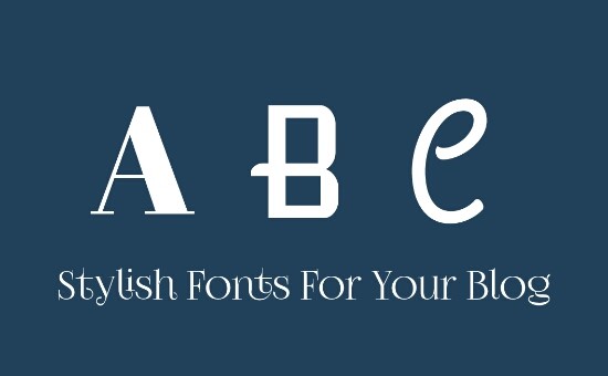
Text font in your blog really matters to the readers and their experience on your website.
Does It matter to your SEO?
No It doesn’t have an impact on your SEO and Rankings in search engines. But there are few situation where readers are trying hard to read a content in your website!
Suppose you are using Cursive or an handwriting font like Pacifico, you blog readers may face difficult reading it! And then, you will loose your readers for ever!
So choosing the Right font for your blog is not at all difficult. You can always use default system fonts like ariel, georgia, times, etc.. But choosing the readable stylish fonts are!
Stylish Fonts
Here are my favourites that is stylish and also readable. I cannot argue that it is the ‘Top 10’ But It gives nice feeling to me while I am using these fonts!
Everyone have their own Top 10s. Here are Mine!
Alice
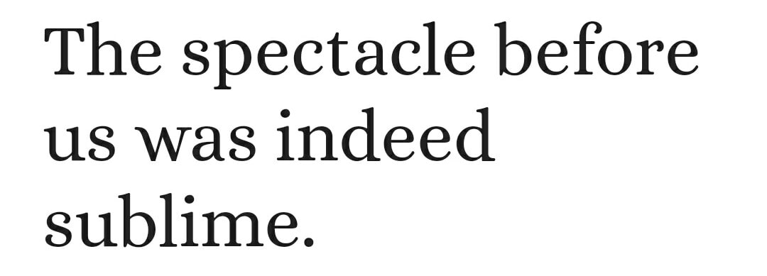
Ksenia Erulevich, designer of the Alice typeface, was inspired by Lewis Carrol’s novel and decided to make a typeface that will be suitable for typesetting that book.
It came out eclectic and quaint, old-fashioned, having widened proportions, open apertures, and soft rounded features; perfect for both long meditative text typesetting and headlines.
This was Ksenia’s first typeface, developed during her diploma in Type and Typography in Moscow, Russia. It was made ready for publication by Gayaneh Bagdasaryan and Alexei Vanyashin.
Petrona
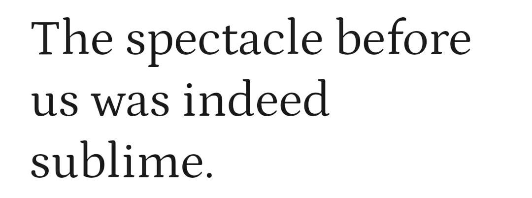
How many characteristics is it possible to add to a font without changing its text type genre? Petrona is inspired by every home’s cook, who playfully maneuvers ingredients and decors with a personal touch, without derailing from the original recipe.
This font has been created like in the kitchen, with sharp elements that forge its structure and with gestural strokes for finishing features.
Petrona’s expression evokes a personal culinary style; its numbers of uniform height include fractions to describe ingredients. This is why connoisseurs recommend it for culinary texts. But taste and creativity are personal, for which every one will apply it according to their own preference.
Gentium Book Basic
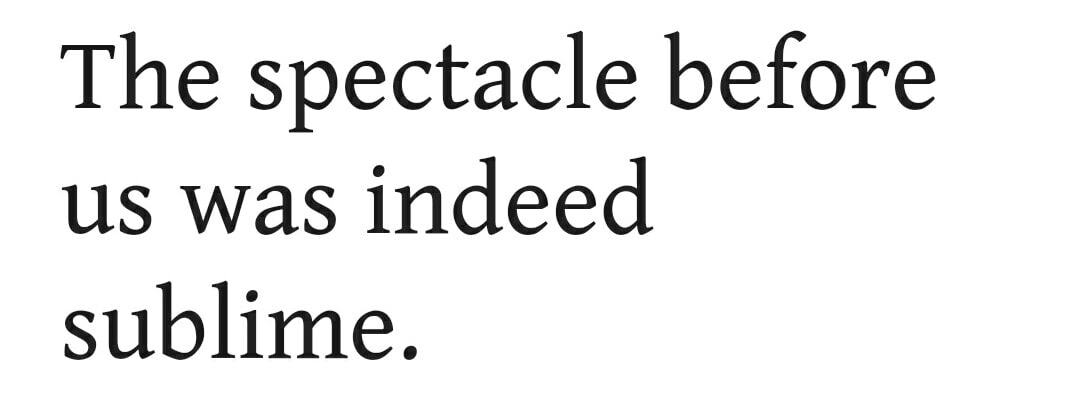
The Gentium Book Basic font family is based on the original Gentium design, but with additional weights. The family comes with a complete regular, bold, italic and bold italic set of fonts.
The supported character set, however, is much smaller than for the main Gentium Plus fonts. These “Basic” fonts support only the Basic Latin and Latin-1 Supplement Unicode ranges, plus a selection of the more commonly used extended Latin characters, with miscellaneous diacritical marks, symbols and punctuation. In particular, these fonts do not support full extended Latin IPA, complete support for Central European languages, Greek and Cyrillic.
Laila
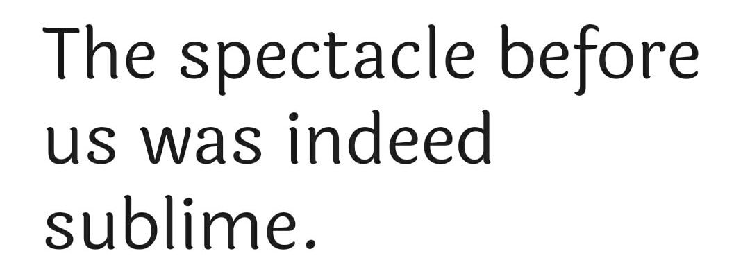
Laila is an informal sans serif design with brush terminals. It has a very contemporary, 21st century appearance. Text set in Laila appears friendly, or even cute! Laila looks especially good in headlines. It is a display typeface, but it may also be used to set shorter passages of text, too.
Laila’s Latin component has a high x-height and open counter forms. In terms of the thickness of its strokes, everything is mostly monolinear. The Devanagari component is even more fluid, appearing lively and graceful. The height is between the Latin x-height and capital height. The strokes thickness is a little lighter than in the Latin; in text blocks, texts set in each script will have similar color.
Amethysta
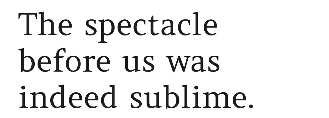
Amethysta was designed by Konstantin Vinogradov with the purpose of printing on low quality paper in mind. This is why it has such minimalistic wedge serifs and terminals. It builds the impression of a simple and strong text typeface. In terms of proportions it is closely related to the transitional serif group.
Amethysta is suitable for small to medium sizes, while some details will be noticeable at larger sizes. It also will work well in print.
Kurale
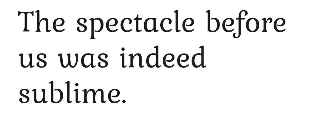
Kurale is a Latin, Cyrillic and Devanagari typeface derived from Gabriela. The Latin and Cyrillic is a serif typeface with soft shapes, and special terminal forms which are shaped like curls. They connect each letter to create attractive word shapes and text blocks with a fine texture. The Devanagari is a modulated design that harmonises with the Latin original. In small bodies of text she works well for reading, and in headlines provides interesting details to catch the eye.
Asar
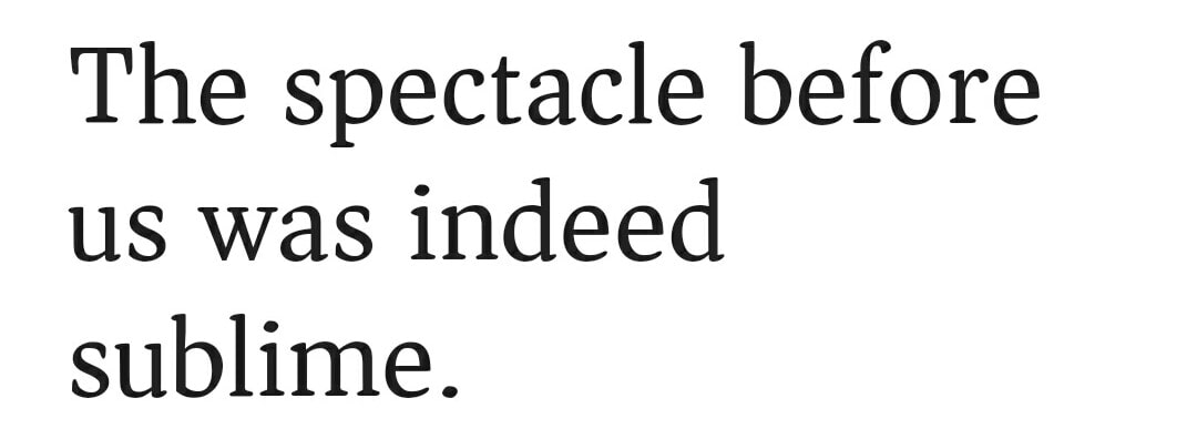
Asar is an original Devanagari and Latin typeface that is based on an expanding brush stroke following a heart line. The design is meant to work well with long texts while maintaining a certain charm at large sizes. Asar is partially derived from Pria Ravichadran’s Palanquin, starting by interpreting that design’s overall proportions and heart lines and glyph set and OpenType features.
The design arrives at its own identity by adjusting for the density of certain brush strokes, that dictate wider spacing and new forms. The brush used is the Expand Path feature of Fontlab Studio 5, using a width of 93, an angle of -55, and a roundness of 35. In general the letters are designed so as to not require further adjustment, but where this is not satisfying then manual adjustments are made.
Della Respira
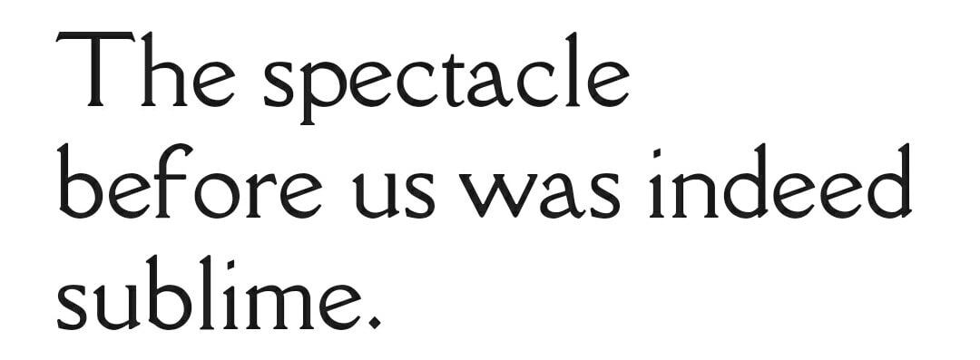
Della Respira is a revival of the 1913 Della Robbia typeface by American Type Founders, based on T.M. Cleland’s typeface of the same name.
Judson
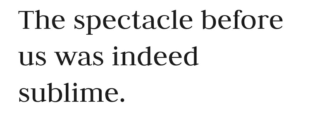
Judson is a serif font designed for African literacy. It contains as many glyphs and precomposed combinations that I know of for all African languages written in Latin-derived alphabets. It uses OpenType tables for correct placement of diacritical marks, including stacked marks. Care has been taken so that all characters are easily distinguished, even in the italic face. The medium roman face has support for the International Phonetic Alphabet (IPA.)
Currently Judson is only available in medium roman, italic and bold roman faces; at this time there is no bold italic.
Imprima
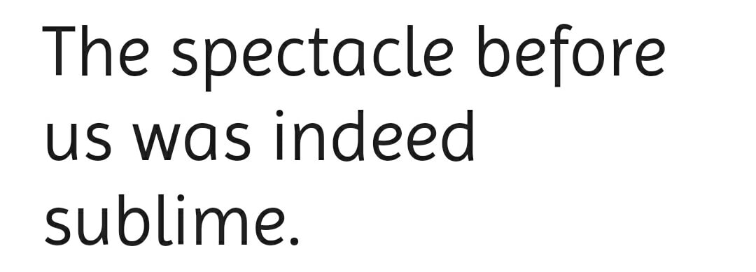
Imprima looks excellent even on cheap home printers because it has broad counters, strong joins between stems and inktraps that enable it to perform well in very small sizes. Professionally printed documents will make it look even better, especially in large sizes, because there the details of its design that are distinctive become clearly visible. The design of this typeface family is cared for as one cares for your own family. Each component has been treated humanely, by hand.
Conclusion
As I already mentioned, This list is only my favourites and you may have your own! Not everyone feels the same!
Fonts brings elegance to your contents. Many fonts that gives stylish looks to your blog is expensive. But here I only mentioned the free and open fonts that is freely available to use in any of your works!
All these details and styles are collected from google fonts directly and it is available for you to add in your blog easily from google fonts.
If you wanted to know which type of font any website using, Read This Article
